How Personal Color Analysis Elevates Your Visual Storytelling in Photography
In the ever-evolving world of photography, where visual storytelling reigns supreme, the significance of personal color analysis transcends the realm of personal style and fashion. It becomes a fundamental tool in crafting narratives that are not only visually stunning but emotionally resonant. In this exploration of personal color analysis and its profound impact on photography, I’ll dive deep into the intricacies of this art, uncovering how it transforms the way we capture and convey stories of your business or family.
What is Personal Color Analysis?
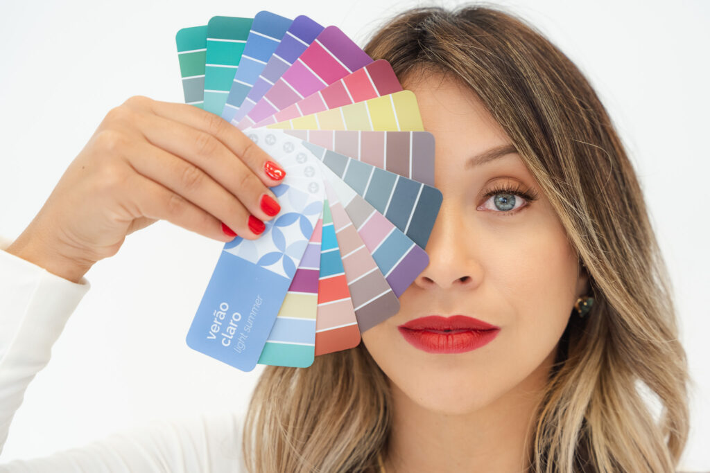
Color analysis, also known as personal color analysis or seasonal color analysis, is a method used to determine the most flattering colors for an individual based on their natural features such as skin tone, eye color, and hair color. The goal is to identify a person’s unique color palette, which consists of a range of colors that complement and harmonize with their inherent tones. This process goes beyond personal preferences and fashion trends, focusing on the science of color and its impact on an individual’s appearance. By understanding one’s color profile, individuals can make informed choices about clothing, makeup, and even hair color, ultimately enhancing their overall look. Color analysis is often categorized into different “seasons,” each with its own set of recommended colors based on warm or cool undertones and contrast levels. This personalized approach to color not only influences personal style but can also have a significant impact on the visual storytelling aspect of photography and branding.

Seeing Beyond the Lens: How to Determine Your Season
To unlock the transformative potential of personal color analysis, it’s crucial to understand the concept of seasons, similar to nature’s ever-changing palette. Just as landscapes transition from the warm tones of autumn to the cool hues of winter, individuals are similarly categorized into distinct seasons, each characterized by a unique color palette that complements their natural features.
The initial step in this exploration involves deciphering the nuances of an individual’s skin temperature, hue, and depth. Skin temperature refers to the underlying warmth or coolness of the skin, which can be assessed by observing whether veins appear more greenish (indicating warmth) or bluish (indicating coolness) through the skin. Hue involves identifying whether the skin has warm, cool, or neutral undertones. Warm undertones exhibit hints of yellow, peach, or gold, while cool undertones showcase hints of pink, blue, or purple. Neutral undertones balance a combination of warm and cool tones.
Depth, on the other hand, refers to the intensity or darkness of the skin. Observing how the skin reacts to sunlight can provide insights into its depth—whether it tans easily or tends to burn.
Once armed with an understanding of these foundational elements, we can move on to assessing contrast levels. High-contrast individuals often have a noticeable difference between their hair, eye, and skin colors, while low-contrast individuals exhibit more subtle variations. Medium-contrast individuals fall somewhere in between.
This nuanced analysis lays the groundwork for identifying the individual’s season. Warm undertones and a preference for warm colors may align with the vibrant hues of Autumn, while cool undertones and harmony with cool colors may suggest a connection to the serene palette of Winter.
While self-assessment can be a helpful starting point, seeking the expertise of a specialized professional can provide more accurate and personalized results. Trained color analysts, often found in image consulting or personal styling services, possess the knowledge to conduct in-depth assessments and guide individuals toward discovering their specific season. These professionals use a combination of draping, color swatches, and their trained eyes to identify the colors that enhance an individual’s natural beauty. For those eager to embark on this exploration, consider reaching out to a color analysis specialist in your local area. Their expertise can illuminate your unique color palette, unlocking a world of possibilities for enhancing your personal style and visual impact.

The Impact of Colors on Appearance: Why It Matters in Photography
Colors have a profound psychological impact, influencing emotions, perceptions, and memories. In photography, this section delves into each season’s characteristics. From enhancing natural beauty to creating a specific mood, photographers learn to wield the power of colors deliberately. The discussion transcends personal aesthetics to underscore the pivotal role of color in establishing context, whether capturing intimate family moments or crafting the visual identity of a brand. In essence, the deliberate use of color is a potent storyteller, influencing how an audience engages with and interprets a photograph.
Aligning Colors with Imagery: Guide to the Twelve Seasons
Understanding the twelve seasons of personal color analysis opens a palette of possibilities for you. Each season, from the bold and contrasting hues of Winter to the soft and muted tones of Summer, contributes to the visual narrative in distinct ways. Check out below the Twelve Seasons with practical insights into how to align your characteristics with the most fitting color palettes.
1. Winter:
- Undertones: Cool
- Contrast: High
- Characteristics: Winters boast a dramatic contrast between their dark hair and fair or cool-toned skin. Cool-toned eyes, often blue or grey, complete the picture. Winter individuals shine in bold jewel tones like emerald green, royal blue, and deep burgundy.
2. Cool Winter:
- Undertones: Cool
- Contrast: High
- Characteristics: Similar to Winter but with a more delicate touch. Lighter eye and hair colors, such as icy blonde and light blue, create a softer yet still high-contrast appearance. Think cool pastels and icy hues.
3. Deep Winter:
- Undertones: Cool
- Contrast: High
- Characteristics: Deep features with dark hair and eyes, often accompanied by deep, cool-toned skin. This season shines in rich, deep jewel tones like plum, sapphire, and emerald.
4. Summer:
- Undertones: Cool
- Contrast: Low to Medium
- Characteristics: Summers embody a soft and cool elegance. Light hair, often blonde or light brown, with cool-toned eyes and fair to cool-toned skin. Opt for muted pastels like lavender, dusty rose, and powder blue.
5. Light Summer:
- Undertones: Cool
- Contrast: Low to Medium
- Characteristics: Lighter features compared to Summer. Light hair and eyes with fair, cool-toned skin. Soft pastels and light neutrals complement the gentle contrast of Light Summer.
6. Soft Summer:
- Undertones: Cool
- Contrast: Low to Medium
- Characteristics: A muted palette with cool undertones. Soft, cool-toned features with medium contrast. Think soft and muted hues like periwinkle, mauve, and dusty rose.
7. Spring:
- Undertones: Warm
- Contrast: Low to Medium
- Characteristics: Springs radiate warmth and vitality. Light hair, warm-toned eyes, and fair to light-toned skin. Fresh, vibrant colors like coral, mint, and buttery yellow accentuate their natural glow.
8. Light Spring:
- Undertones: Warm
- Contrast: Low to Medium
- Characteristics: Similar to Spring but with lighter features. Golden blonde or light brown hair, light eyes, and fair to light-toned skin. Embrace soft and warm pastels for a harmonious look.
9. Warm Spring:
- Undertones: Warm
- Contrast: Medium
- Characteristics: A richer version of Spring with warm, golden undertones. Warm brown hair, warm-toned eyes, and medium-toned skin. Earthy tones like terra cotta, olive green, and mustard complement their warmth.
10. Autumn:
- Undertones: Warm
- Contrast: Medium to High
- Characteristics: Autumns radiate richness with warm, deep features. Dark hair with red or golden undertones, warm-toned eyes, and medium to dark-toned skin. Earthy tones like rust, olive green, and mustard enhance their natural warmth.
11. Soft Autumn:
- Undertones: Warm
- Contrast: Low to Medium
- Characteristics: Muted warmth defines Soft Autumns. Lighter hair and eyes with warm undertones and medium contrast. Soft, muted tones like peach, camel, and olive suit their gentle warmth.
12. Deep Autumn:
- Undertones: Warm
- Contrast: Medium to High
- Characteristics: Deep and warm features define Deep Autumns. Dark hair, warm-toned eyes, and medium to dark-toned skin. Rich, warm colors like deep burgundy, olive, and mustard enhance their deep, autumnal vibe.
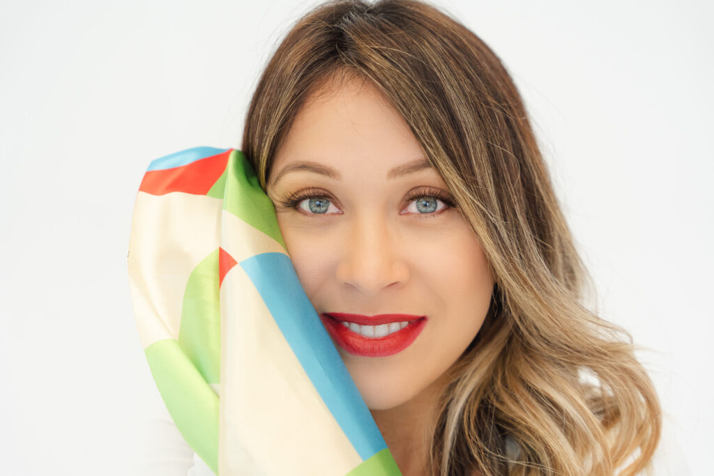
In practical terms, this knowledge guides not only wardrobe choices but also informs decisions about background, lighting, and overall composition. The result is not merely a photograph but a personalized piece of art, where every element works in harmony to showcase the individual’s unique beauty within the context of their season. As we embrace the art of personal color analysis, every click of the shutter becomes an intentional stroke on the canvas of visual storytelling.
Crafting Visual Harmony: The Real-World Impact for Photographers
Understanding your season is the key to unlocking the true potential of your photography session. This knowledge serves as a bridge between theory and application, providing the tools to transform our vision while planning your photo session into a tangible masterpiece of perfect photos.
In practical photography, When individuals are aware of their designated color season, a harmonious synergy unfolds. The outfit choices seamlessly align with their natural tones, and the selected location becomes a canvas that complements their unique palette.
The result is more than just a photograph; it’s a visual component that transcends the frame. It’s an image where every element is in perfect concert, where the subject is not just captured but celebrated in a way that feels intuitively right. Visual harmony becomes the backbone of your work, creating images that are not just compelling but deeply resonant and uniquely reflective of the individuals they portray. In the realm of personal color analysis, the final product isn’t just a picture; it’s a work of art that tells a story of authenticity, connection, and visual brilliance.
Elevating Your Photography with Personal Color Analysis
As clients embrace the knowledge of their unique color palette, they become active collaborators, ensuring that every element, from wardrobe to backdrop, harmonizes seamlessly. This collaboration doesn’t merely produce photographs; it crafts visual masterpieces that resonate with authenticity and uniqueness. For photographers, guiding individuals through the journey of choosing their best outfit isn’t just about offering a service; it’s about going beyond where every image becomes a celebration of true essence, a reflection of individuality bathed in the perfect palette, resulting in photographs that transcend the ordinary, serving as evidence to the profound influence that color harmony exerts on the art of visual photography storytelling
Sorry, the comment form is closed at this time.